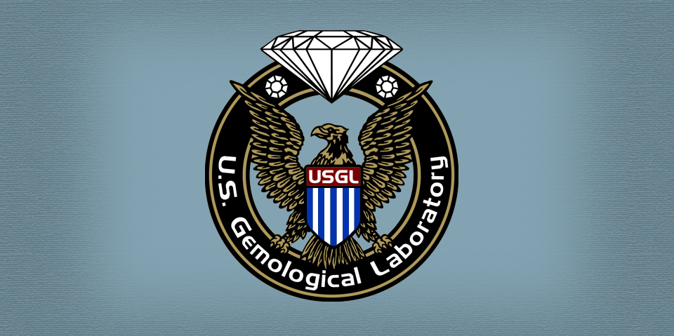
When creating a logo that invokes american prestige in an iconic symbol, there is honestly no better choice for a US company than the visual of an eagle. It may seem over used, but when your a national company which services the american public and regulates something therein – it must be a seal that symbolizes government approval and an eagle does that every time. Several sketches were produced to get the feel for the eagle and how it was to be used. A few key poses were presented and everyone was very impressed with the front view seen above. Once that choice was made, the final illustration process began.

Design:
Two hours of research time was spent on eagle poses and we found that this concept has been done so many times in the past that a straight view was required to be somewhat unique. Five hours were spent drawing sketches on paper to determine that fact. Eight sketches were presented and everyone agreed that the front view pose was a great success.
Production:
After the concept sketch was approved, the final illustration process could begin. It was decided by all parties involved that the final symbol deserved to be presented as a circle to resemble a seal of approval. Fitting the eagle into that area required a bit or artistic license in the sense that the wing span could not be exact. We all agreed that only a small amount of critics would notice that fact, so it was not an issue when it came to the final presentation. Everyone was very impressed with the final logo illustration.
What was included:
• Research (2 hours)
• 8 Concept sketches (5 hours)
• 3 color presentations (.50 hours)
• One high resolution illustration (4.5 hours)
• Final hi-res logo EPS and AI vector files